Docs
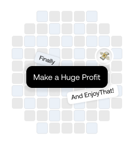
Motion Cards
Motion Cards
The MotionCard component is a GSAP-powered animated card layout that pins content during scroll and animates child elements.
Scroll to Explore Component
All in one


Install the following dependencies:
pnpm add gsap @gsap/react
Make a file for cn and mergerRef functions and match the import afterwards
import clsx, { ClassValue } from "clsx"
import { twMerge } from "tailwind-merge"
export const cn = (...classes: ClassValue[]) => twMerge(clsx(...classes))Make a file and copy paste this code in a file with name product-preview.tsx
"use client"
import { ReactElement, RefObject, useEffect, useRef, useState } from "react"
import gsap from "gsap"
import { ScrollTrigger } from "gsap/ScrollTrigger"
import { useGSAP } from "@gsap/react"
import { cn } from "@/lib/utils"
gsap.registerPlugin(ScrollTrigger)

interface MotionCardProps {
  mainText:
    | {
        text: string
        className: string
      }
    | string
  cards: ReactElement[]
  scrollerRef?: RefObject<HTMLElement>
}

export function MotionCard({
  mainText,
  cards,
  scrollerRef,
}: MotionCardProps) {
  const masterRef = useRef<HTMLDivElement>(null)
  const childRef = useRef<HTMLDivElement>(null)
  const cardRefs = useRef<HTMLDivElement[]>([])
  const instanceIdRef = useRef<string>(
    `rotating-text-${Math.random().toString(36).substring(2, 11)}`
  )
  const [forceUpdate, setForceUpdate] = useState(false)

  useEffect(() => {
    if (scrollerRef?.current) {
      setForceUpdate(!forceUpdate)
    }
  }, [scrollerRef?.current])
  //ajust this value accordingly to have desired animation or you can also increase
  //  the element inside and remove the conditional check below
  const vars = [
    { left: "150%", top: "0%" },
    { left: "10%", top: "-80%" },
    { left: "180%", top: "55%" },
    { left: "-100%", top: "50%" },
    { left: "200%", top: "80%" },
  ]

  useGSAP(() => {
    if (!masterRef.current || !childRef.current) return
    const existingTrigger = ScrollTrigger.getById(instanceIdRef.current)
    const existingTrigger2 = ScrollTrigger.getById(instanceIdRef.current + "2")
    if (existingTrigger && existingTrigger2) {
      existingTrigger.kill()
      existingTrigger2.kill()
    }

    gsap.to(masterRef.current, {
      scrollTrigger: {
        trigger: masterRef.current,
        start: "top top",
        end: "bottom 40%",
        pin: true,
        scroller: scrollerRef?.current ?? window,
        id: instanceIdRef.current,
      },
    })

    const tl = gsap.timeline({
      scrollTrigger: {
        trigger: childRef.current,
        start: "top top",
        end: "bottom 10%",
        scrub: 1,
        scroller: scrollerRef?.current ?? window,
        id: instanceIdRef.current + "2",
      },
    })

    tl.to(childRef.current, {
      scale: 0,
    }).fromTo(
      cardRefs.current,
      {
        left: (index) => vars[index]?.left || "0%",
        top: (index) => vars[index]?.top || "0%",
      },
      {
        left: "50%",
        top: "50%",
      },
      "<"
    )
  }, [forceUpdate])
  //this will return if legth is small than 1 or more than 5
  if (cards.length > 5 || cards.length < 1)
    return <div>Inappropriate card length </div>
  return (
    // Wrapper div for pinning
    <div
      ref={masterRef}
      className="w-full h-screen flex justify-center items-center  relative overflow-hidden"
    >
      {/* This div has scrub and scale with ScrollTrigger */}
      <div
        ref={childRef}
        className="w-full h-full flex justify-center items-center"
      >
        <h1
          className={cn(
            "text-9xl font-extrabold  text-center px-32",
            typeof mainText === "string" ? "" : mainText.className
          )}
        >
          {typeof mainText === "string" ? mainText : mainText.text}
        </h1>
      </div>

      {/* Mapping cards here with absolute positioning */}
      {cards.map((Card, i) => (
        <div
          key={i}
          className={cn(
            "absolute w-[300px] block -translate-x-1/2 -translate-y-1/2"
          )}
          ref={(el) => {
            if (el) cardRefs.current[i] = el // Assign instead of push
          }}
        >
          {Card}
        </div>
      ))}
    </div>
  )
}Props
| Name | Type | Description |
|---|---|---|
mainText* | string or { text: string; className: string } | Main heading text or an object containing text and a CSS class. |
cards* | ReactElement[] | An array of React elements representing the cards to be animated. |
scrollerRef | RefObject<HTMLElement> (optional) | Reference to the scrolling container; defaults to window. |
Note: Props marked with
*are required.
Credit: This component is inspired by Jeton.